If you have been working with data and frequently analysis it, histograms and frequency polygons are two of the most common tools that you might be familiar with. By using these two tools, you can visually represent the distribution of your data. In this article, we will talk about how to create histograms and frequency polygons in Excel.
Histograms
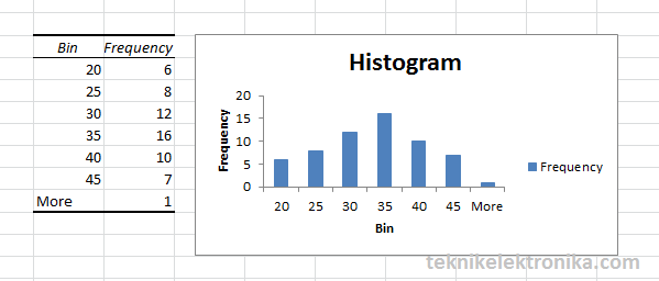
Histogram is a type of bar chart that shows the distribution of continuous data. It divides the values into small intervals called bins and counts the number of values that fall into each bin. The height of each bar represents the number of values in that bin. It is a great tool to analyze the spread and skewness of your data.
How to Create a Histogram in Excel?
Follow the steps below to create a histogram in Excel:
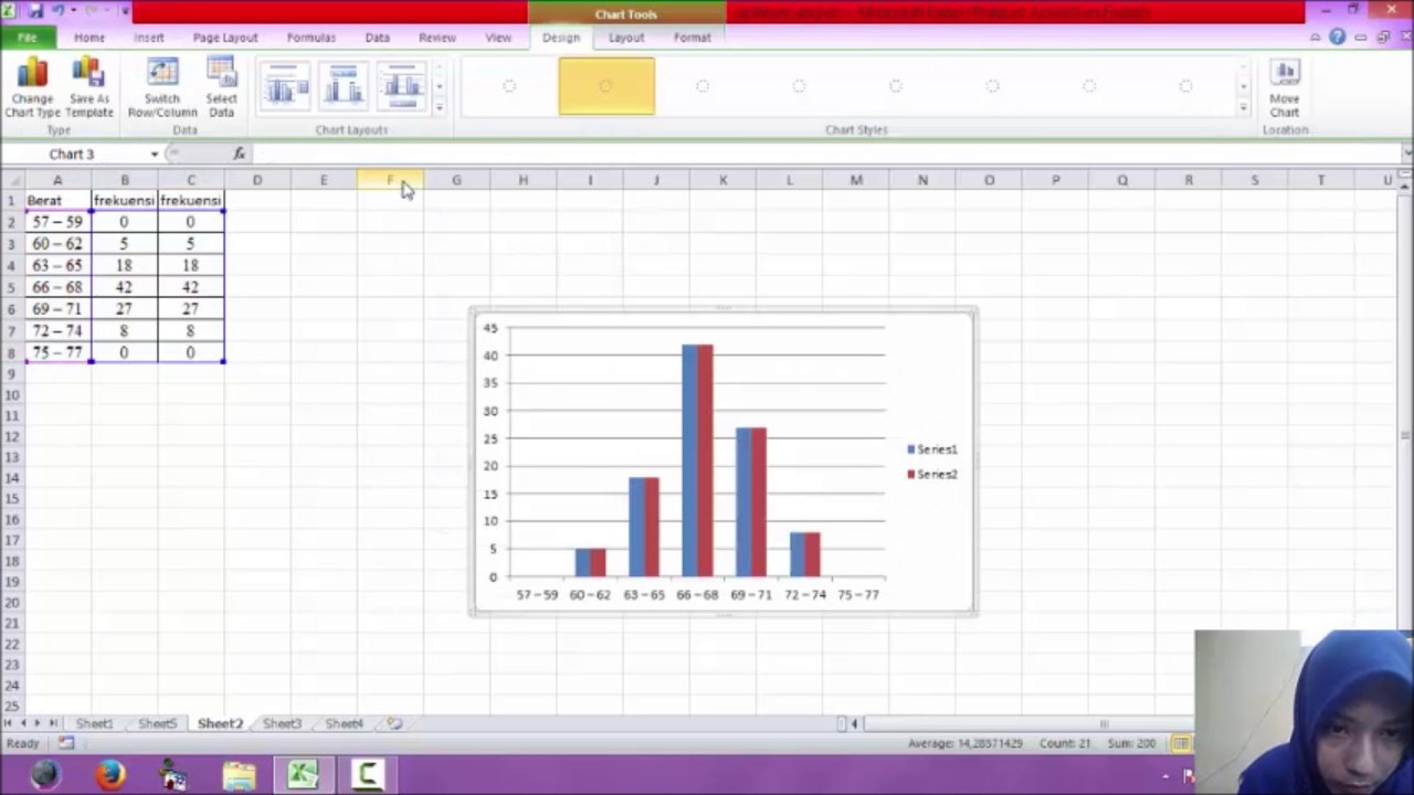
- First, you need to organize your data into a column. Open a new Excel document and enter your data in one column.
- Next, select the data and click on the “Insert” tab on the top menu.
- Look for the “Charts” section and click on the small arrow next to it.
- Choose the “Histogram” option under the “Histogram” tab.
- Excel will show you a preview of your histogram. You can customize it by changing the data range, bin width, and other options.
- Once you are satisfied with the settings, click on “OK”.
Excel will create a histogram for you based on your data. You can also customize the format of the chart by changing the color, font, and other settings.
Frequency Polygons
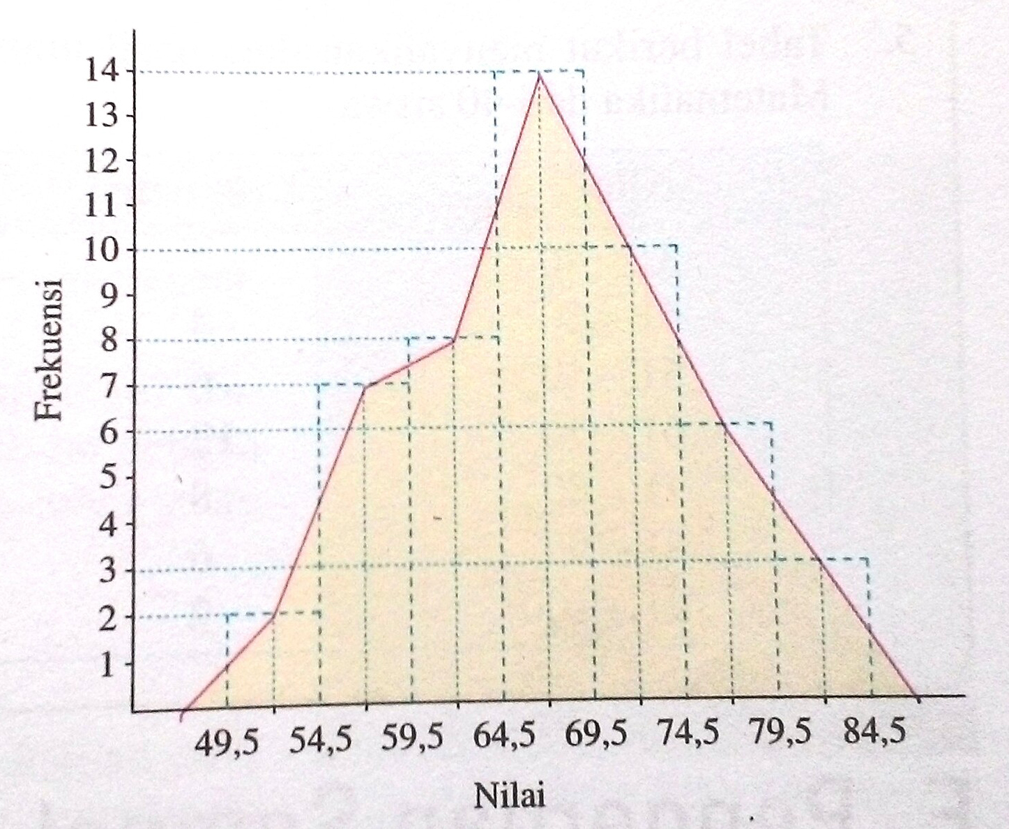
Frequency polygon is another tool to visualize the distribution of your data. It is similar to a line chart but each point represents the number of values that fall into a certain interval. By drawing a line connecting these points, you can see the trend of your data.
How to Create a Frequency Polygon in Excel?
Follow the steps below to create a frequency polygon in Excel:
- Start by organizing your data into intervals. To do this, you need to choose the number of intervals or bins and find the frequency of values that fall into each bin.
- Open a new Excel document and enter the intervals and their corresponding frequencies in two columns.
- Select the data and click on the “Insert” tab on the top menu.
- Look for the “Charts” section and click on the small arrow next to it.
- Choose the “Line” option under the “Line” tab.
- Excel will create a line chart for you. You can customize it by adding gridlines, changing the axis labels, and other settings.
- To convert the line chart into a frequency polygon, right-click on the chart and choose “Select Data” from the menu.
- In the “Select Data Source” dialog box, click on the “Edit” button under “Legend Entries (Series)”.
- Change the “Series Name” to “Frequency Polygon” and the “Series Y Values” to the frequency column you created earlier.
- Click on “OK” to close the dialog boxes. Excel will update the chart with the frequency polygon.
FAQ
What is the difference between a histogram and a frequency polygon?
While both histogram and frequency polygon are used to visualize the distribution of your data, there are some differences between the two:
- A histogram is a bar chart that shows the number of values that fall into each interval. The height of each bar represents the frequency of values in that interval.
- A frequency polygon is a line chart that shows the trend of the distribution. Each point on the line represents the number of values that fall into a certain interval. By connecting these points, you can see the overall shape of the distribution.
Can I create a histogram or frequency polygon in other software besides Excel?
Yes, there are many tools available to create a histogram or frequency polygon. Some of them are:
- Python – You can use libraries like Matplotlib and Seaborn to create histograms and frequency polygons in Python.
- R – R has built-in functions like hist and plot to create histograms and frequency polygons.
- Tableau – Tableau has a built-in function to create histograms and frequency polygons, and it also allows you to customize the format of the chart.
Conclusion
Histograms and frequency polygons are powerful tools to visualize the distribution of your data. By using Excel, you can create both of these charts with ease. If you need to work with data analysis frequently, it is a good idea to learn how to create these charts and how to customize them to fit your needs.
Video Tutorial
Want to see how to create histograms and frequency polygons in action? Check out the video below:


