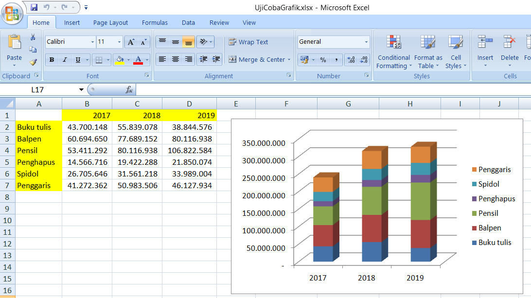
Creating graphs and charts is an essential part of analyzing and presenting data in various domains such as research, business, education, and journalism. Microsoft Excel, a widely used spreadsheet program, offers several tools to generate graphs and modify their appearance with ease. In this article, we will go through some techniques to modify the visual aspects of graphs in Excel to make them more comprehensible and engaging. We will also provide FAQs and a video tutorial to enhance your learning experience.
Modifying Graphical Elements in Excel
Excel provides several options to add, edit, and format graphical elements in charts and graphs to improve their readability. Here are some of the most common methods:
Changing the Title and Axis Labels
The title and axis labels of a graph are essential to convey its message accurately. By default, Excel generates these labels based on the data range of the chart, but you can modify them to better represent the information. To change the title, click on the graph, select “Chart Tools” from the top menu, and go to the “Layout” tab. In the “Labels” group, click on “Chart Title” and choose an option from the dropdown menu, such as “Above Chart,” “Centered Overlay Title,” or “More Title Options” to customize the font, size, color, and alignment of the title. You can also type a new name for the title directly into the chart:
To modify the axis labels, click on any of the axes, select “Format Axis” from the context menu, and go to the “Axis Options” tab. You can change the font, size, color, and orientation of the labels, as well as their position on the axis. You can also customize the number format of the axis values, such as adding a prefix or suffix, and adjust the minimum and maximum values of the axis scales. Excel also allows you to display multiple axes in a graph, such as a secondary axis for a different data set:
Adding Data Labels and Markers
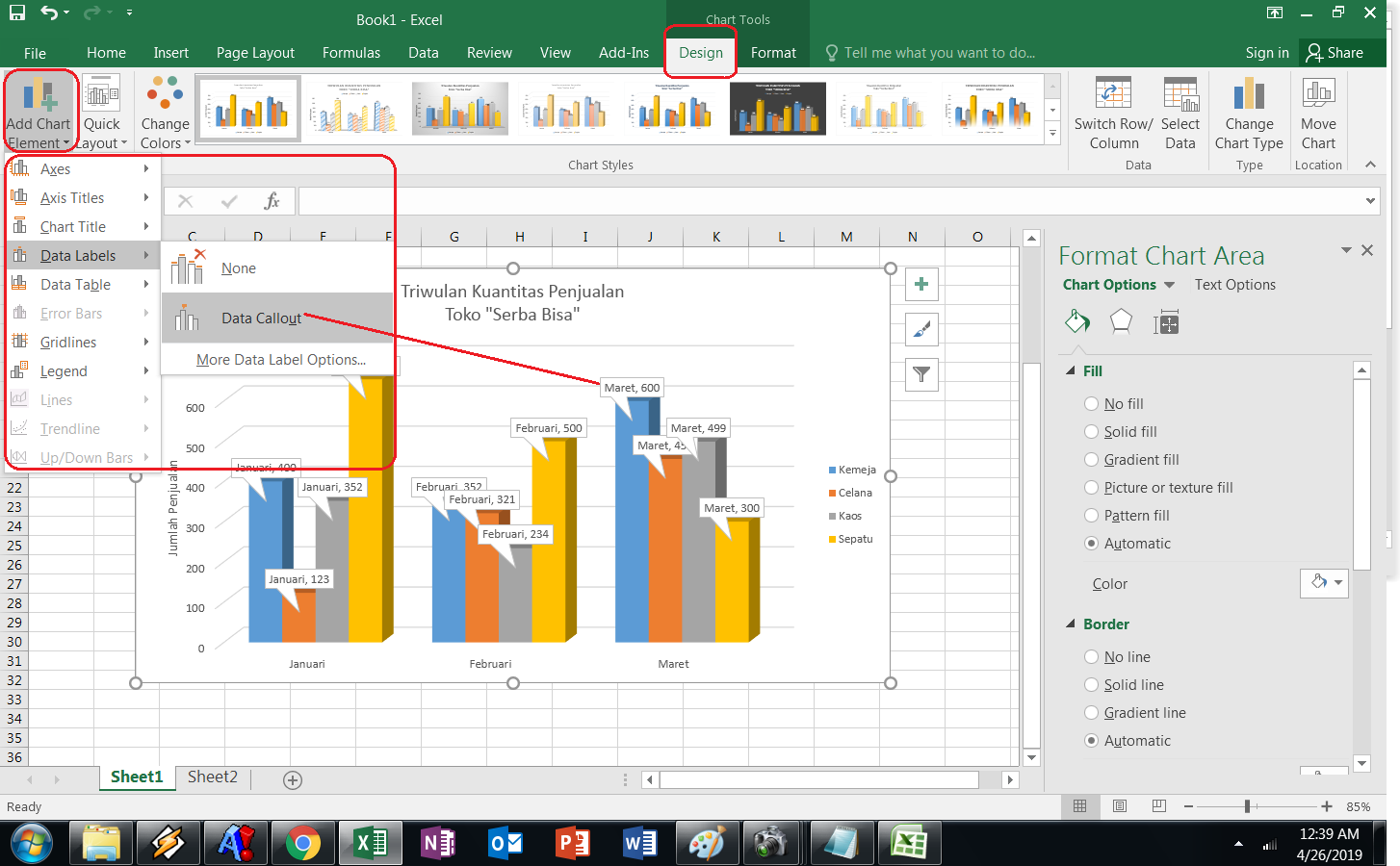
Data labels and markers are important to give context and precision to a graph’s data points. Excel allows you to add various types of labels and markers to a chart, such as category names, series names, values, percentages, and custom text. To add data labels, click on the data series to select it, and go to the “Layout” tab under “Chart Tools.” In the “Labels” group, click on “Data Labels” and choose an option from the dropdown menu, such as “Outside End,” “Inside End,” or “Value,” to show the labels next to the data points. You can also format the labels’ font, size, color, and position:
To add markers, such as dots, crosses, or squares, to the data points, click on the data series, select “Marker Options” from the “Format Data Series” menu, and choose the marker type, size, color, and transparency. You can also customize the shape and fill of the markers based on the data values or categories, and even use your own image as a marker:
Changing the Chart Type and Layout
The chart type and layout have a significant impact on the visual appeal and clarity of a graph. Excel offers several chart types, such as column, line, pie, area, scatter, and bubble, each with their own advantages and limitations. To change the chart type, select the chart, go to the “Design” tab under “Chart Tools,” and click on “Change Chart Type.” Select the desired chart type from the list, and Excel will automatically adapt the data format and appearance to fit the new type:
You can also modify the layout of the chart by adding or removing chart elements, such as titles, legends, data tables, error bars, trendlines, or axis titles. To add an element, click on the chart, select “Chart Tools,” and go to the “Layout” tab. In the “Labels” or “Analysis” group, click on the element you want to add, such as “Legend,” “Trendline,” or “Error Bars,” and choose an option from the menu. To remove an element, click on it, and press “Delete” or “Backspace” on your keyboard:
FAQs
How do I create a graph in Excel?
To create a graph in Excel, follow these steps:
- Select the data range you want to plot.
- Go to the “Insert” tab and click on the chart type you want to create, such as “Column,” “Line,” or “Pie.”
- Excel will generate a default chart based on the data range. You can modify the chart’s appearance and data source by using the options under “Chart Tools” and “Design.”
How do I modify the colors of a graph in Excel?
To modify the colors of a graph in Excel, follow these steps:
- Select the chart you want to modify.
- Go to the “Design” tab under “Chart Tools.”
- Click on the “Change Colors” button and select a color scheme from the dropdown menu.
- You can also customize the colors of individual chart elements, such as data series, chart area, or plot area, by clicking on them and selecting “Format” from the context menu. In the “Format” dialog box, choose the “Fill” or “Line” tab and select a color:
Video Tutorial
For a more detailed and interactive tutorial on modifying graphs in Excel, check out this video:
With these techniques and tips, you can make your Excel graphs and charts more informative and visually appealing, whether you use them for professional or personal purposes. Keep experimenting with different styles and layouts to find the best fit for your data and audience.


