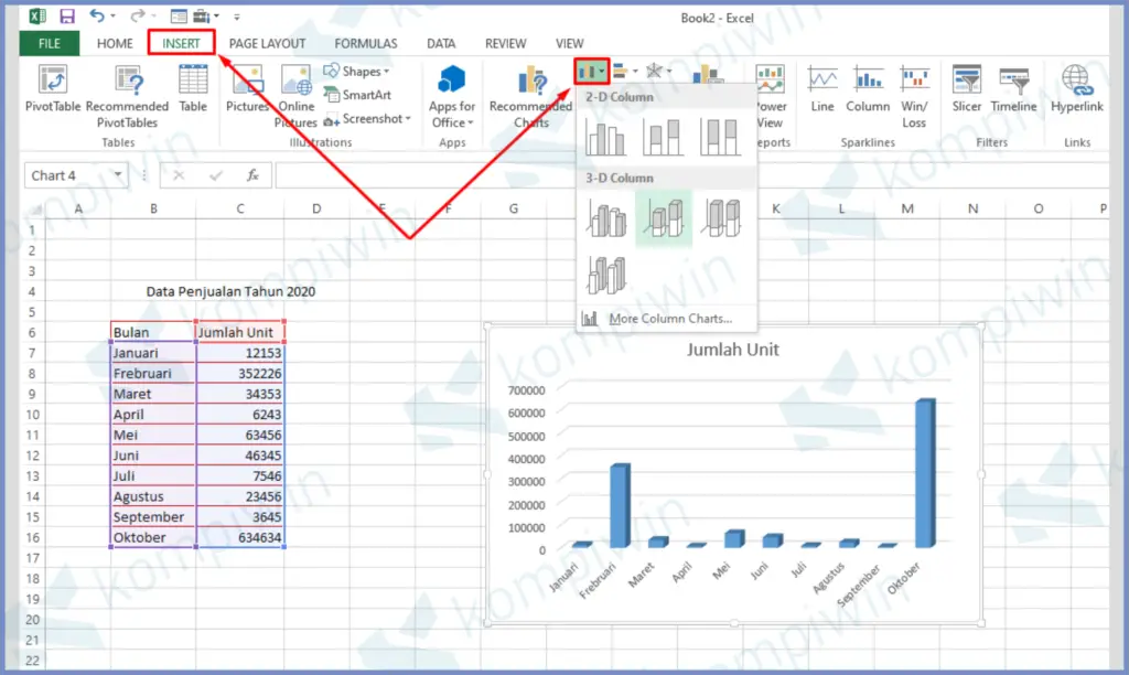
Creating diagrams in Excel can be a useful tool when summarizing and presenting data. Two common types of diagrams in Excel are pie charts and bar graphs. In this article, we will explain how you can create these diagrams in Excel and provide videos to help guide you through the process.
Pie Chart
A pie chart is a circular chart that takes different percentages of a value to form various sized wedges. Pie charts are commonly used to show the distribution of data.
How to Create a Pie Chart in Excel
To create a pie chart in Excel, you must first input the data you want to represent in the chart.
1. Highlight the data you want to use in the chart, including any headers or labels if needed.
2. Click on the Insert ribbon, select the Pie Chart option, and choose the type of chart you want to create.
3. The chart will appear on the sheet, and you can adjust its size and position as desired.
4. You can customize the colors, labels, and other chart features in the Design and Format ribbons.
Pie Chart Example:
In the example above, we created a pie chart to represent the distribution of expenses in the month of January. The chart shows that 30% of expenses were spent on groceries, 10% on entertainment, and 60% on bills.
Bar Graph
A bar graph is another type of chart commonly used in Excel. Bar graphs consist of bars that represent different values and are commonly used to compare data.
How to Create a Bar Graph in Excel
To create a bar graph in Excel, you must first input the data you want to represent in the chart.
1. Highlight the data you want to use in the chart, including any headers or labels if needed.
2. Click on the Insert ribbon, select the Bar Chart option, and choose the type of chart you want to create.
3. The chart will appear on the sheet, and you can adjust its size and position as desired.
4. You can customize the colors, labels, and other chart features in the Design and Format ribbons.
Bar Graph Example:
In the example above, we created a bar graph to represent the sales of different products in a store. The graph shows that product A had the highest sales, followed by product B and C.
FAQs:
1. How can I edit a chart in Excel?
To edit a chart in Excel, click on the chart to select it. You can then use the options found in the Design and Format ribbons to customize the chart’s appearance, data range, and other features.
2. What other kinds of charts can I create in Excel?
In addition to pie charts and bar graphs, Excel offers many other types of charts, including line charts, scatterplots, and histograms. The type of chart you use depends on the data you want to represent and how you want to display it.
Video Tutorial:
For those who prefer visual instructions, the following video tutorial shows step-by-step how to create a pie chart and bar graph in Excel:
By following these instructions, you can create effective diagrams in Excel to better present your data and improve your reporting and analysis.

