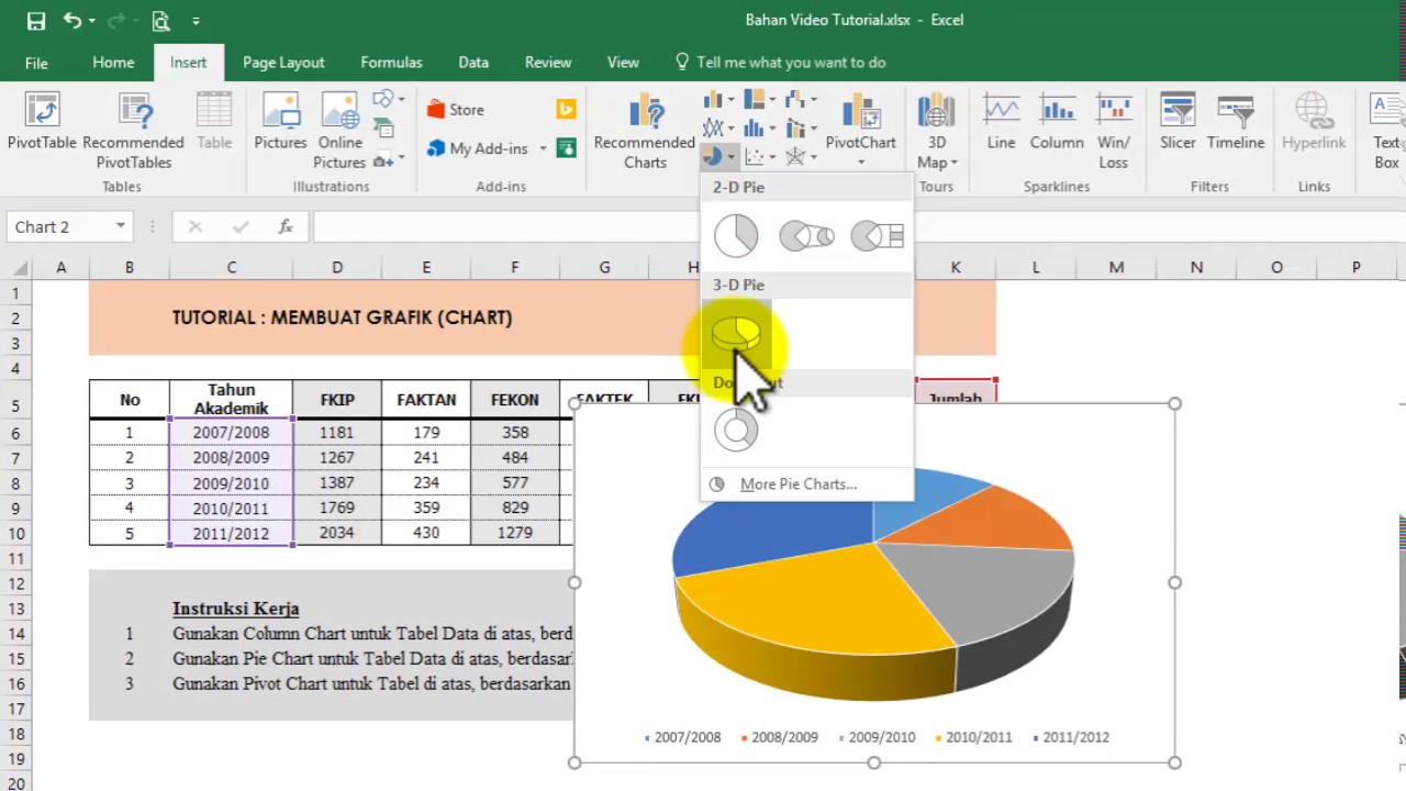
Making graphs and charts is an essential part of data presentation and analysis, especially in the business world. Excel is a widely used tool for creating graphs, and charts, and it is an excellent option for beginners to start with as it is easy to use and comes pre-installed on most computers. However, knowing the right techniques and tricks for making different types of graphs can give you an edge in data analysis and presentation. In this article, we will show you the simple trick to create graphs in Microsoft Excel 2016 and learn about different types of graphs and their applications.
Jenis Grafik di Microsoft Excel
Before diving into how to make graphs on Excel, let’s learn about the different types of graphs you can make using Microsoft Excel. Generally, Excel has ten types of graphs:
- Column chart
- Bar chart
- Line chart
- Pie chart
- Scatter chart
- Area chart
- Doughnut chart
- Radar chart
- Combo chart
- Stock chart
Cara Membuat Grafik di Microsoft Excel
Membuat Grafik di Microsoft Excel cukup mudah dan sederhana, hanya perlu mengikuti beberapa langkah berikut:
- Pilih Data yang akan dibuat grafik
- Pilih jenis grafik yang akan dibuat
- Customize Grafik
- Finalisasi Grafik
Now let’s discuss each step in detail.
Pilih Data yang akan dibuat grafik
Before creating a graph in Excel, we need to have the data that we want to graph. The data can be in the form of columns or rows, and it should be organized in such a way that it is easy to understand and analyze. The data can be typed into the worksheet manually, or it can be imported from an external file such as a CSV or TXT file.
Once the data is ready, we can select the cells that we want to graph. It is recommended to select the whole range of data that we want to include in the graph, including headers.
Pilih Jenis Grafik yang akan dibuat
Excel offers ten types of charts, and we can choose the one that fits our data type and presentation style. The easiest way to select a chart is to use the Recommended Charts option. Recommended charts analyze the data and suggest the best chart type depending on the data type and content. To use the Recommended Charts option, follow the steps below:
- Select the data range that we want to graph
- Click on the Insert tab from the Ribbon
- Click on the Recommended Charts option from the Charts section of the Ribbon
- Select a chart and click on the OK button
Alternatively, we can manually select the chart type using the chart section of the Ribbon. To manually select a chart, follow the steps below:
- Select the data range that we want to graph
- Click on the Insert tab from the Ribbon
- Select the chart type from the Charts section of the Ribbon
- A drop-down menu will appear, and we can select the desired chart style
Customize Grafik
After selecting the type of chart, we can customize it to fit our requirements and presentation style. The customization options may vary depending on the type of chart we selected, but some common customization options are:
- Title: We can add a title to our chart to make it more descriptive and informative. The title should briefly explain the data and the purpose of the chart.
- Legend: The legend is a key that explains what each data series represents in the chart. We can customize the location, font size, and style of the legend.
- Data labels: Data labels are the numerical values that appear next to each data point in the chart. We can customize the format, position, and font size of data labels.
- Axis: The axis is the scale that appears around the chart. We can customize the format, scale, and number format of the axis.
- Gridlines: Gridlines are horizontal and vertical lines that appear in the chart and help the viewer to read the data more effectively. We can customize the color, style, and size of the gridlines.
Finalisasi Grafik
After customizing the chart, we can finalize the graph by reviewing and editing it for any necessary changes. We can make sure that the graph is informative, clear, and easy to read. We can also proofread the graph title, axis labels, and data to make sure there are no typos and errors. Finally, we can save the graph in a suitable format and share it with the intended audience.
Frequently Asked Questions
Q. What type of chart should I use to represent numerical data with two variables in Excel?
A. If you want to represent numerical data with two variables, you can use the scatter chart or bubble chart in Excel. The scatter chart plots data using vertical and horizontal axes and uses the data markers to represent the values of the third variable. The bubble chart is similar to the scatter chart but uses a third variable to determine the size of the data markers.
Q. Can I make 3D charts in Excel?
A. Yes, Excel provides an option to create 3D charts. However, it is not recommended to use 3D charts as they distort the data and make it difficult to read and interpret. 3D charts are more suitable for decorative or entertainment purposes rather than data analysis.
Video Youtube
Watch this video to learn how to create different types of graphs and charts using Microsoft Excel:

