Are you struggling with creating a histogram in Excel? You’re not alone! Fortunately, there are many tutorials available online to guide you through the process. In this article, we’ll show you some of the best resources for creating a histogram using Excel and provide helpful tips for creating an effective graph.
What is a Histogram?
A histogram is a graph that displays the frequency distribution of a set of data. It is a type of bar chart that shows the number of data points that fall into categories or bins. The x-axis represents the bin ranges, and the y-axis represents the frequency count for each bin.
Histograms are useful for analyzing data and detecting patterns. They are commonly used in statistics, finance, and science for visualizing data distributions and identifying anomalies.
Creating a Histogram in Excel
Excel is a powerful tool for creating histograms. To create a histogram in Excel, you will need a data set and a few steps to follow. Here is a step-by-step guide:
- Type your data into the Excel worksheet. Make sure the data is in a single column. For example, if you wanted to create a histogram of the ages of a group of people, you would enter each person’s age in a single column.
- Click on the “Insert” tab on the Excel ribbon. Then, click on the “Recommended Charts” button to open the gallery of chart options.
- Select “Histogram” from the list of chart options.
- Excel will automatically generate a histogram chart based on your data. You can customize the chart by clicking on the chart area and using the formatting tools in the “Chart Tools” menu.
Tips for Creating an Effective Histogram in Excel
Here are some tips for creating an effective histogram in Excel:
- Choose the right bin size: The bin size determines the width of the bars in the histogram. A bin size that is too large will result in a graph that is too vague to detect any patterns. A bin size that is too small will result in a graph that is too detailed and difficult to read. A good rule of thumb is to use between 5 and 20 bins, depending on the size of your data set.
- Label the x-axis: The x-axis represents the values of the data set, so it’s important to label it appropriately. In our example of ages, you would label the x-axis “Age”.
- Label the y-axis: The y-axis represents the frequency count, so it’s important to label it appropriately. In our example of ages, you would label the y-axis “Frequency”.
- Add a title: A clear title can help to convey the purpose of the histogram and make it easier to read and understand. In our example of ages, you could use a title such as “Age Distribution of Group”.
Resources for Creating a Histogram in Excel
There are many resources available online to help you create a histogram in Excel. Here are some of the best:
Tutorial Cara Membuat Grafik Histogram Di Word Beserta Gambar | Images
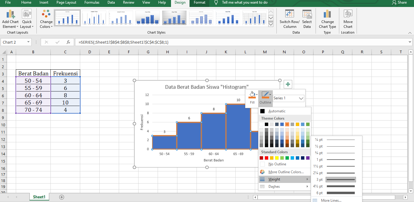
This tutorial is a great resource for those who prefer a step-by-step guide with images. The tutorial provides clear instructions on how to create a histogram in Excel and includes screenshots to help you follow along. It also covers some advanced topics, such as adding a mean line to the histogram.
Cara Membuat Grafik Histogram Di Excel – IMAGESEE
This tutorial is another excellent resource for creating a histogram in Excel. It provides clear instructions on how to set up your data, select the appropriate chart options, and customize your histogram. The tutorial also includes screenshots to help you visualize the process.
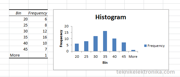
Hasil-dari-pengolahan-data-menjadi-Histogram-di-Excel.png?x91019
This tutorial is a great resource for those who prefer a hands-on approach. It provides a step-by-step guide to creating a histogram in Excel and includes screenshots to help you follow along. It also includes tips for customizing your histogram, such as changing the color of the bars or adding a title.
Frequently Asked Questions About Histograms in Excel
1. What is the difference between a histogram and a bar chart in Excel?
A histogram is a type of bar chart that displays the frequency distribution of a set of data. The difference between a histogram and a bar chart in Excel is that a histogram groups numerical data into bins, while a bar chart is used to represent categorical data. Additionally, in a histogram, the bars are adjacent to each other, while in a bar chart, the bars are separated by whitespace.
2. Can a histogram in Excel be interactive?
Yes, it is possible to create an interactive histogram in Excel using macros or VBA code. An interactive histogram allows users to filter and sort data by clicking on the chart elements. This can be useful for exploring large data sets and identifying trends or patterns.
Conclusion
Creating a histogram in Excel may seem daunting, but with the right resources and tips, it can be an easy and effective way to analyze data. Whether you prefer a step-by-step guide, a hands-on tutorial, or a video tutorial, there are many resources available online to help you create a histogram. By following the tips for creating an effective histogram, you can ensure that your graph is accurate and easy to read. Try creating a histogram in Excel today and see how it can help you analyze your data!

