With the current pandemic outbreak happening worldwide, we are all starting to understand the importance of data and visualization. One of the most sought-after skills in today’s world is the ability to make sense of data and create interactive dashboards and visualizations. In this article, we will explore how we can create a dashboard in Microsoft Excel to help us understand and analyze COVID-19 data.
 Understanding COVID-19 Data
Before we start creating a dashboard, let’s first understand the data behind it. The COVID-19 pandemic has affected the world in many ways. It has impacted people’s lives, health, and the economy as a whole. The pandemic has created a lot of data with various parameters, such as positive cases, deaths, and recovered cases in different countries and regions.
It is essential to make sense of this data to stay informed and make informed decisions. Visualization plays a crucial role in analyzing this data. Visualization helps in understanding complex data and identifying trends and patterns that are not easily visible in spreadsheets or tables.
 Creating a Dashboard in Excel
Microsoft Excel is a powerful tool for visualizing data with a lot of built-in features such as charts, graphs, and tables. We can use these features to create a dashboard to analyze COVID-19 data. Below are the steps to create a dashboard:
Step 1: Collect and clean the data
The first step is to collect COVID-19 data from reliable sources and clean the data. In this example, we will use the data from the World Health Organization (WHO). We will collect data for confirmed cases, deaths, and recovered cases for different countries and regions.
Once we have the data, we need to clean it by removing any duplicates, errors, or missing values. We can also convert the data into a table to make it more manageable.
Step 2: Create a pivot table
The next step is to create a pivot table that summarizes the data. A pivot table is a table that summarizes data by grouping and aggregating it. We can use the pivot table to create a summary of the COVID-19 data by country and region.
We can create a pivot table by selecting the data and navigating to the Insert tab. From there, we can choose PivotTable and select the range of data. Once we have created the pivot table, we can drag and drop the fields to group and summarize the data as required.
Step 3: Create a pivot chart
Once we have created the pivot table, we can create a pivot chart to visualize the data. A pivot chart is a chart that is based on a pivot table and changes as the pivot table changes. We can use different types of charts such as a bar chart or a line chart to visualize the data.
We can create a pivot chart by selecting the pivot table and navigating to the Insert tab. From there, we can choose PivotChart and select the chart type we want to use. We can also customize the chart by changing its color and layout.
Step 4: Create a dashboard
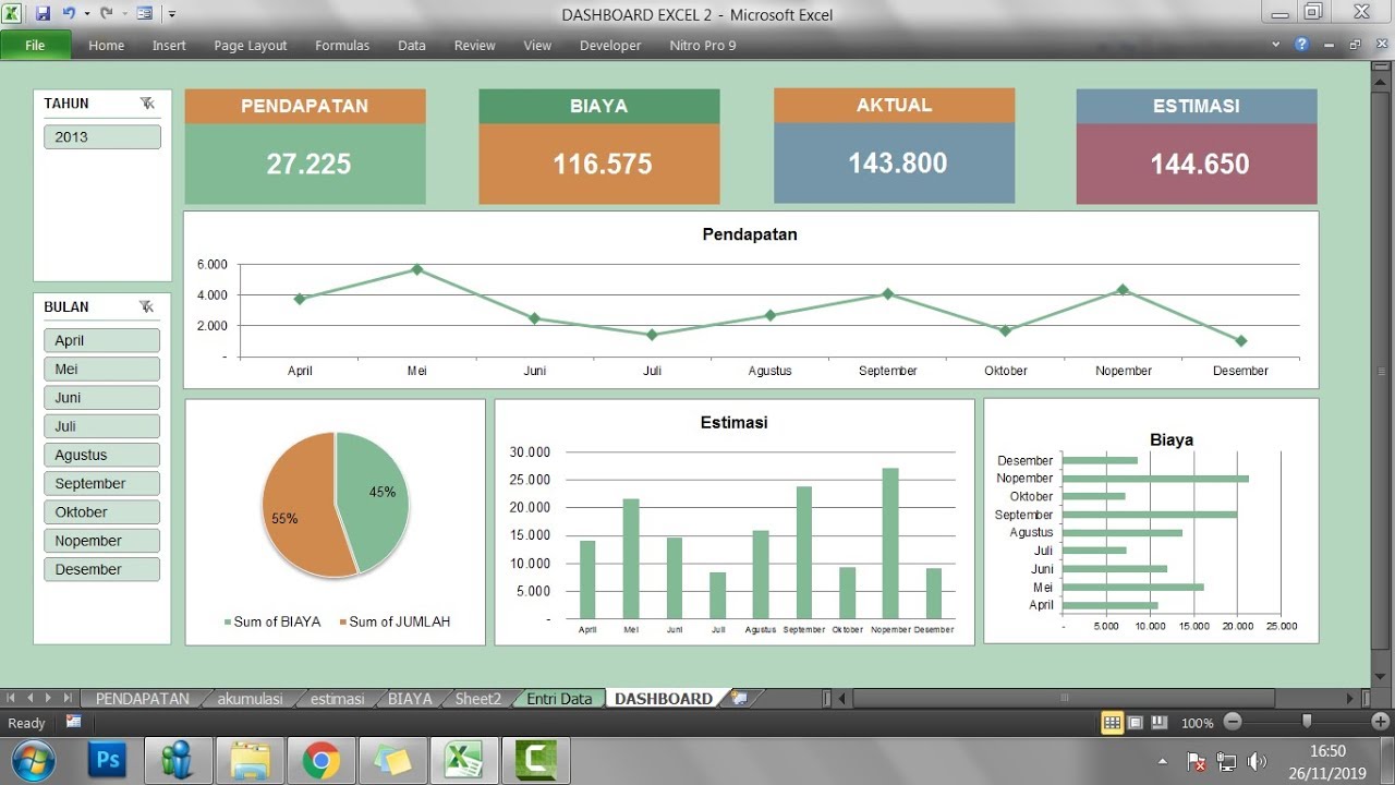
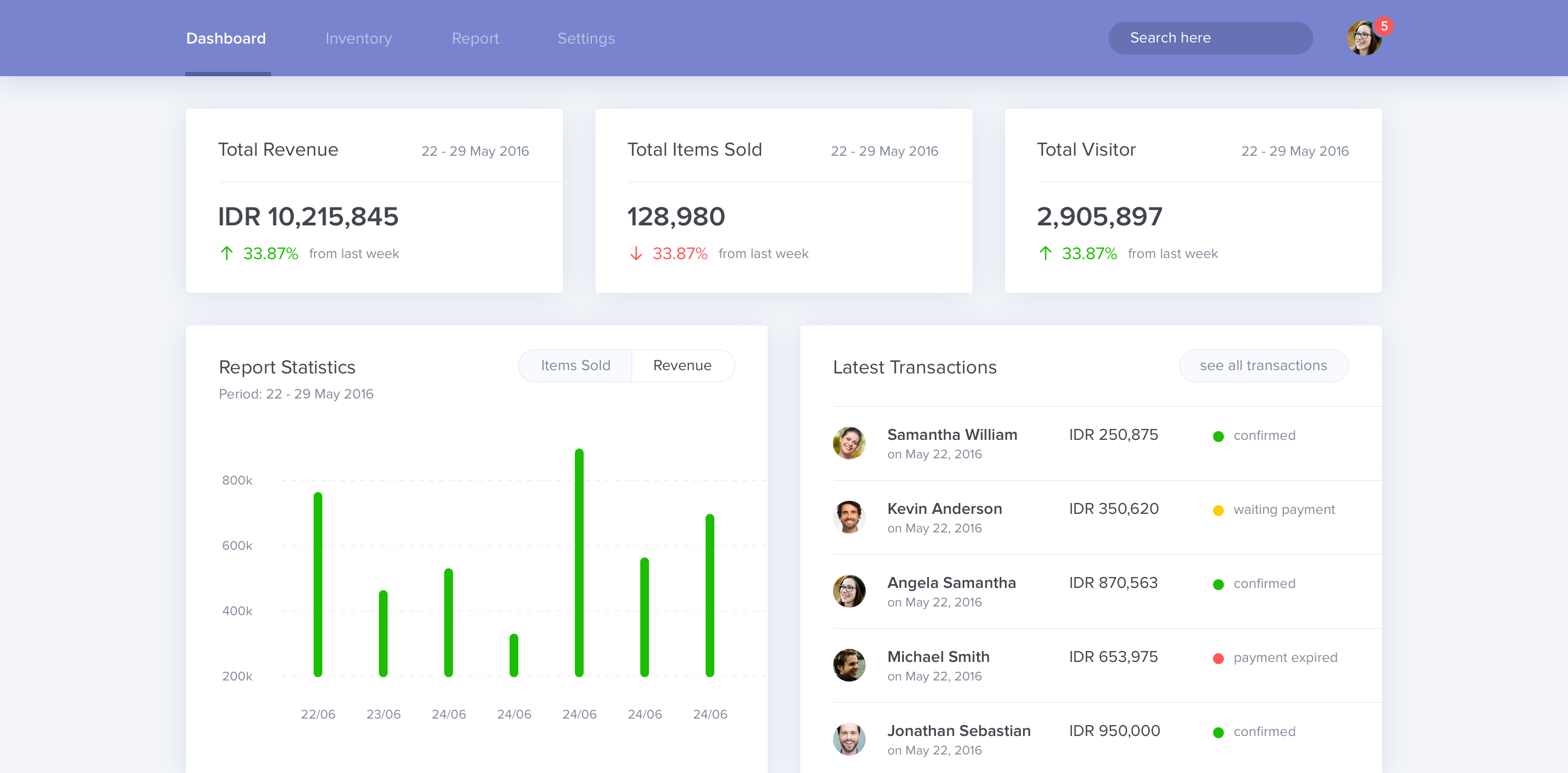
Once we have created the pivot table and the pivot chart, we can combine them to create a dashboard. A dashboard is a single page that summarizes the data and provides different views of the data through charts, graphs, and tables.
We can create a dashboard by inserting the pivot chart into a blank worksheet and adding other charts and graphs that summarize the data. We can also add filters to the dashboard to allow users to filter the data based on different parameters such as country and region.
 Dashboard Design Best Practices
Now that we have created a dashboard, it is important to follow some best practices when designing and presenting the dashboard. Below are some best practices to keep in mind:
Keep it simple
A dashboard should be simple and easy to understand. We should avoid using too many charts or graphs that can confuse the user. We should also use simple labels and avoid technical jargon as much as possible.
Use relevant data
We should only include relevant data on the dashboard. We should avoid including data that is not important or is not directly related to the objective of the dashboard.
Use appropriate charts
We should use appropriate charts to represent the data. Different types of charts are suitable for different types of data. For example, a line chart is suitable for showing trends over time, while a bar chart is better for comparing different categories.
Use colors wisely
We should use colors wisely and consistently. We should use colors that are easy on the eyes and highlight the important aspects of the data. We should also avoid using too many colors that can make the dashboard look cluttered.
 FAQ
FAQ
Q1. Why is it important to create a dashboard to visualize data?
A dashboard is an effective way to summarize and present complex data in a simple and easy-to-understand format. By visualizing data through charts, graphs, and tables, we can identify trends and patterns that are not easily visible in spreadsheets or tables. This makes it easier for us to make informed decisions and take the necessary action.
Q2. What are some best practices to follow when designing a dashboard?
Some best practices to follow when designing a dashboard are:
- Keep it simple
- Use relevant data
- Use appropriate charts
- Use colors wisely and consistently
 Understanding COVID-19 Data
 Creating a Dashboard in Excel
 Dashboard Design Best Practices
 FAQ
FAQ